
Keeping Shoots Cohesive
Hi friends! Let's talk about keeping shoots cohesive. Creating more cohesive shoots is something that we've been working on for a while. When we first started working together, this wasn't even something that we really thought about, we honestly wouldn't even plan that much, we would just show up with a ton of props and hope for the best, which means we ended up with a lot of interesting shots (to put it nicely for the sake of our ego haha). Our goal now is to throughly plan each and every shot and create a set of images that are unique but look like they belong together. In many ways it's more difficult to create cohesive images than to create stand alone images.
What's the importance of a cohesive shoot? Maybe your client wants stand alone images, and that's fine, but most often you'll be shooting for a campaign, website, or for a social media feed and it's important to make sure that all of the images look like they belong together, even if they are shot in different sets. Creating photos that work together will make your shoot stronger. The goal is to create images that are unique and can work alone, but that also come together to really sell the product, brand, idea, and story.
Creating cohesive images can take some practice, but it's something that clients will want to see proof of. This is why we always recommend creating a set of images when doing a test shoot for your portfolio instead of just one-off images. That way when you upload the project to your site, it will show clients that you have the ability to create a set of images in addition to building your skills.
Here's an example of a shoot that was not cohesive - each image on their own is good, but as a group, they just don't work together. There isn't a cohesive story, color palette or background. There really isn't a single thing that brings all the images together.
Here's another example - this shoot is a little more cohesive but still falls short of really standing strong as a group. I do really love these images, they're some of my favorites, but if we were to redo this shoot, I would be more careful with color (there's three different yellows and that teal is only used in one shot) as well as lighting (half of this is inside, half outside) and create a more cohesive theme.
With these examples in mind, let's talk though my top tips for creating cohesion in your shoots.
Stick with a Color Palette.
Sticking to a set of colors is probably the easiest way to create cohesion in a shoot. Usually, if you're working with a client they will have specific brand colors to include and colors to avoid. Make sure to ask them what these are during the planning process. The colors and number of colors that you choose will vary greatly depending on the client and goals of the shoot, but in general we recommend picking a few primary colors and a few secondary or accent colors. It's a good idea to study color theory to learn how to pair colors and what different colors/color combinations communicate to the viewer.
Here are a couple of my favorite color resources:
The Designer's Dictionary of Color
Palette Perfect
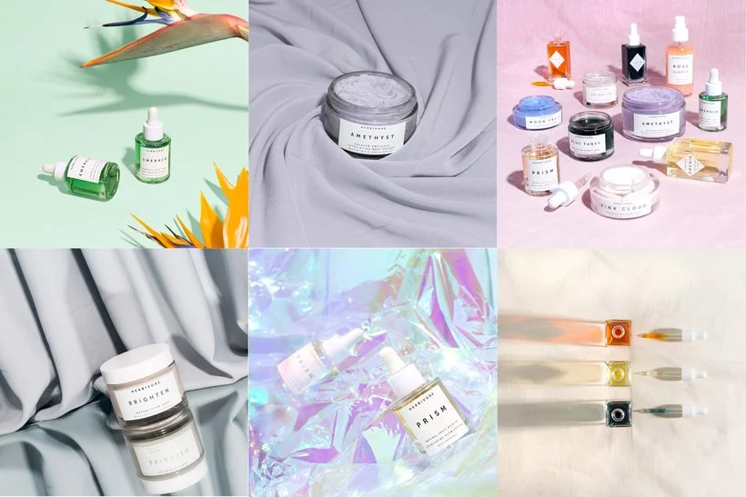
Here's an example of sticking to a strict color palette:
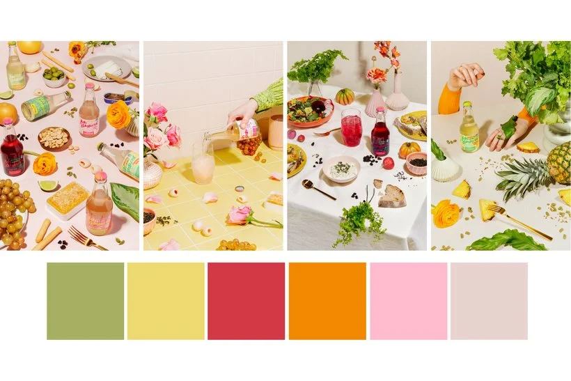
These images are all pretty different in many ways, but they work together because they are in the same style but also pretty much everything in each image falls into one of these colors. This allows them to live in the same space while still being very different.
Use Consistent Lighting
Another way to make sure that your images look cohesive is to use the same lighting style all the way through the shoot. You may need to have different lighting setups - for example if you are shooting a small product alone and then with a model in the same shoot, you will need to light each scene differently, but make sure that the style is the same. If you use hard light in one shot then use hard light throughout the remainder of the shoot. It will also make a difference if you shoot some of the images outside and some inside. This may be a subtle detail, but it will definitely change the look of the images and make it more challenging for them to live in the same space.
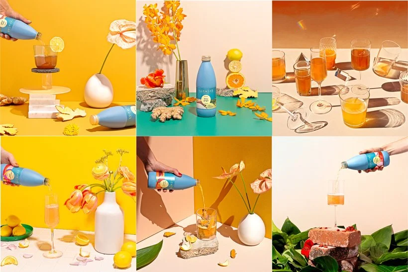
The Sunwink shoot that I shared earlier is an example of shooting in two different The images don't look terrible together, but you can definitely see that there is a difference.
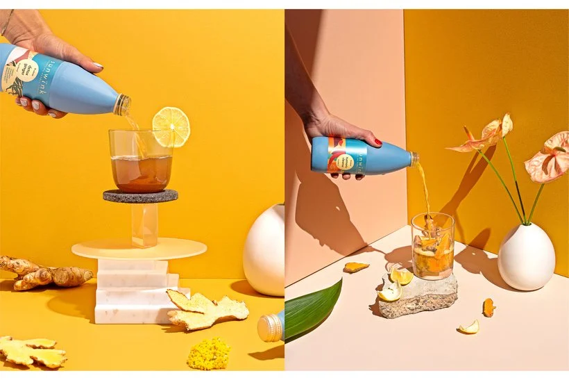
The image on the left was shot in studio with a hard light and the image on the right was outside in the sun. The shadows on the right are even sharper and there's more shadow in general which gives it a slightly different look than the image on the left. This can definitely be done intentionally and well, but it's something to think about and be aware of when you're planning.
Stay Within the Same Style
Sticking to a style will really help with cohesion. Sometimes you may have a client who wants both lifestyle and stylized studio images, and I often try to discourage clients from going this route but there are still ways to apply the same style to both sets of images if they really want two different looks. For example, if they want a looser, more messy style then make sure both the lifestyle and studio shots have those elements and try to still stick to the color palette and reuse elements if you can in order to keep it as cohesive as possible. If you're going for a bright, playful look in the studio then apply that in the lifestyle images as well.
Here's an example of a shoot where we didn't stick to one style:
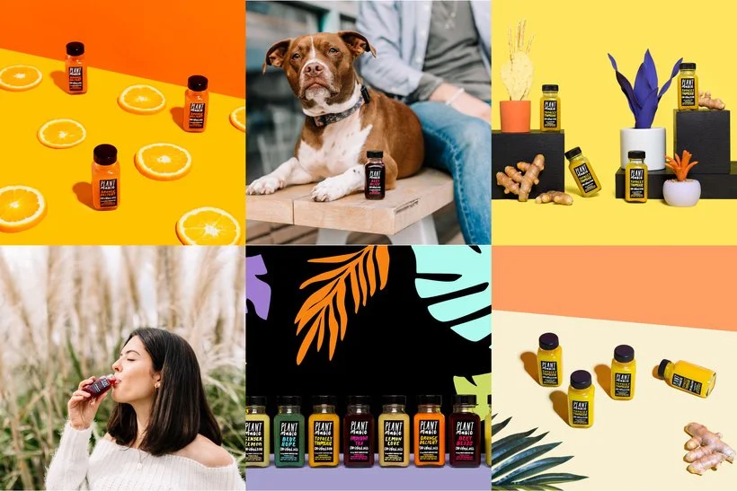
The lifestyle images are very muted and dreamy while the studio shots are more poppy and contrasted. There's even some different styles among the studio shots and there isn't any cohesion in colors or props.
Reuse Sets and Props Throughout the Shoot
Not only will this tip help you to create cohesive images, it will save you time and save your clients money - win win win. One of the easiest ways to do this is to first group images and then go through them to see what themes or items you can run through the entire shoot. For example, maybe you'll use the same colors in every shot so you can reuse the single image backgrounds for the group shots. Or maybe you'll be using the same kind of props throughout the whole shoot so you can include some of the same ones in multiple shots.
Here's an example of reusing props and set items:
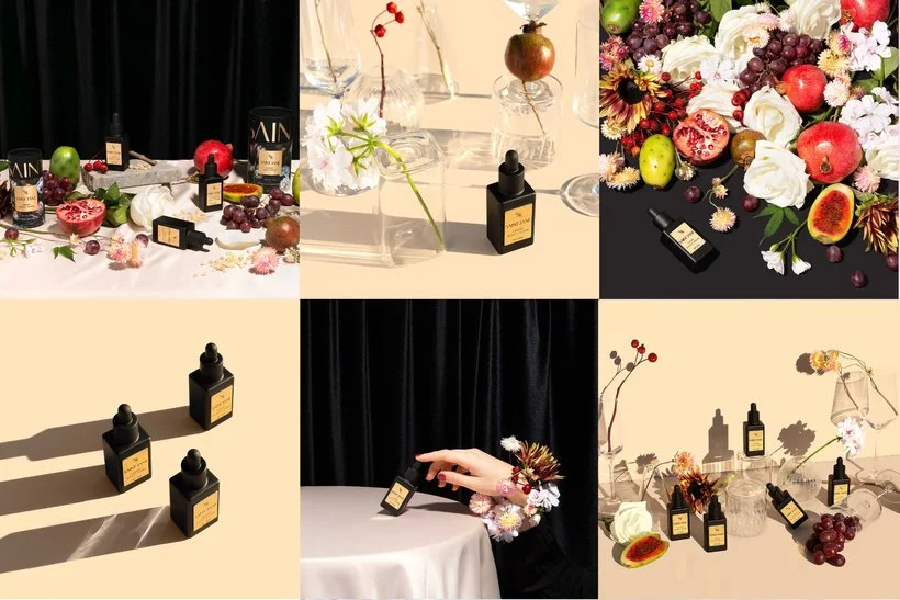
We used the floral and fruit items as well as the clear vases/glasses many times in this shoot but in different ways. We also stuck to a very strict color palette which makes it super cohesive.
Create Groupings of Images
Once we started breaking our shoot into groups of images, our shoots became MUCH more cohesive. It really helped with our planning to start thinking of images in sets and then making sure that each of those sets belong together. Again, how you organize this will really depend on the specific goal of the shoot but heres an example of how this breakdown could work. Say that you are working with a beverage company and they have 3 flavors that you will be shooting and you'll be delivering 8 images. Cherry Images (2) Ginger Images (2) Lemon Lime Images (2) Group Images (4)
In this option, you would have a different set for each flavor and then a set for the group images. You would probably create a similar set for each, but maybe with a different color or different props. Another option would be to create two different sets and shoot 1 individual shot and two group shots in each set.
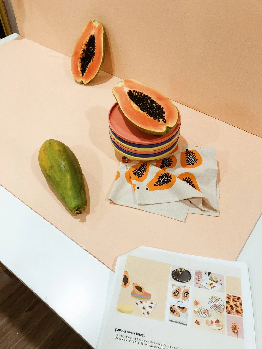
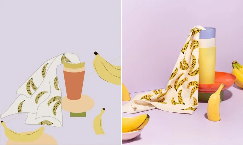
Create Mockups
This is the best way to communicate your vision to clients to get approval in advance of the shoot, but it's also key to making sure that your shots will be cohesive. Sometimes things look much better in your head than in real life, and getting your ideas onto paper will make sure that everything flows in the way that you want. It will also help you to figure out the best way to reuse aspects of the set or props, and make sure you're using color in a balanced way throughout all the shots. Now your clients don't expect you to be an artist, so while we recommend learning how to create mockups in Illustrator or Photoshop since you can make changes easier, even just quick sketches are enough to get the point across and help you plan.
Here's an example of a mockup I made and the final result:
In conclusion, color, style, lighting, and props/set are key things to think about when you're planning and using groupings of images as well as mockups will help you think through all these things in a more organized way. I don't want you to think of all these elements as hard and fast rules because after all, rules were made to be broken sometimes, but I do think that you need to know and understand the rules in order to break them in the best way when it's appropriate. Overall, I think that keeping cohesion in your shoots will help you to build a more professional portfolio and attract bigger clients.
If you need some help with structuring your planning, check out our customizable shoot plan download. It comes with a guide (both written and video) for building a shoot plan that you can use for yourself and also to communicate with clients.
Let me know your thoughts and if you have any other tips for keeping a shoot cohesive below!
Is it the weekend yet?
Elle