

Adding Graphical Elements to Your Images Part 1
Guys! It's been a minute. Hope you're all recovered from the post-holiday slump that is Thanksgiving. Anyone else binge watch Wednesday on Netflix? *raises hand* Man, what a great show. I am officially obsessed with Jenna Ortega. It's always so exciting to see more female protagonists and honestly, what a great storyline. Ok before I get too sidetracked, I want to talk a little bit about graphical elements in photography and how you can use them to make your imagery unique as hell. I think part of our personal style is inspired by a lot of graphic design out there and we love incorporating those elements into our photography whenever given the opportunity.
Now I'm not talking about adding "text" or making collages. I'm referring to more subtle elements like adding shapes or digital patterns. One creative that immediately comes to mind that loves to play around with adding graphical element is our friend Diane Villadsen (@dianewithonen). Another two couples that also have a very graphical style of imagery is Colors Collective (@colorscollective) and Tropico Photo (@tropicophoto). Make sure to check them all out because they've done a great job of really bringing that graphical side to imagery. So for this post, I want to share a few of the ways that we've been able to add digital elements to our photography to really make them "pop." Yes. I said pop. Don't murder me, haha!
Digitize A Prop or Background
Ok this one is one of the simplest ways to add a little graphical *touch* to your imagery and who knows, you may have already been doing it already without realizing it. Essentially you're taking whatever it is you photographed, whether it's a prop or a backdrop and you're digitizing it so that it looks like it had always been made in Illustrator or Photoshop. If you're in our Saturday or Sunday level, you might remember one of the tutorials I shared about "wiping" the background. And that's exactly what you're doing when you're digitizing a prop or backdrop. You're taking out the texture and simply replacing it with a color overlay to make it look like it was a digital element all along.
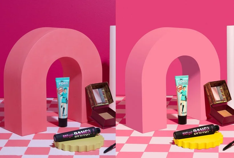
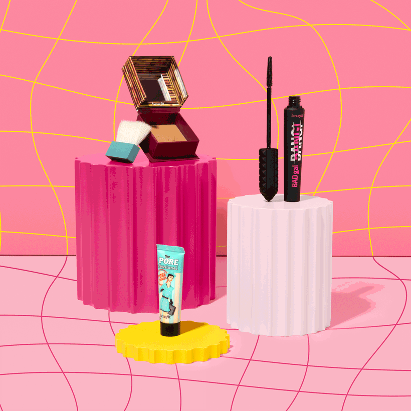
Check out the example below of one of our images for Benefit Cosmetics. Our poor Moodelier prop has been used so much that it started to get really textured and we hadn't sanded it down in a little while. Our client was pretty particular about getting their exact brand colors so I knew I was going to be changing the color of the prop anyway so I digitized it and even added a subtle gradient on the side of the arch to make it match the way it was initially photographed. I even added the shadow inside the arch as well. I remember when I was first editing this still image, I was thinking to myself, am I going too far with this "fake" look? But I immediately knocked some sense into me and was like, this little "world" we're creating for these products is already some weird wacky pinklandia situation anyway. How weird can anything really look in the world of product photography... Know what I mean?
The other thing I wanted to point out in the image below is how I was able to digitize the backdrop as well. That checkered ground was painted by hand by Elle and bless her soul for trying to get it perfect but sometimes you need it to be polished. Therefore, I went in with some Photoshop magic and digitized that as well. Gotta love it!
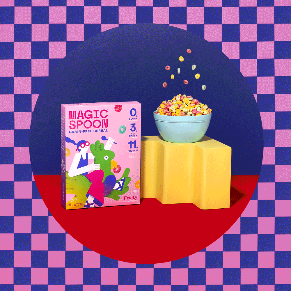
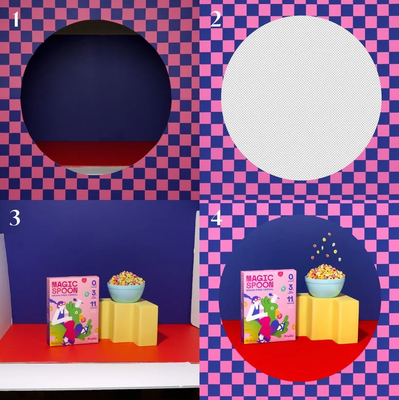
Oh and here's another quick example of us digitizing a prop. You may have noticed it at the top of this post but it was a GIF we created as a personal project featuring Magic Spoon. Elle had actually done the work of creating the checkered pattern onto particle board and then cut out the circle. So we made sure to photograph it exactly where we wanted it to be. In hindsight, she probably didn't need to do all of that (again, bless her soul!) but it was a helpful guide eitherway. In the end, I did digitize the pattern in Photoshop by just cleaning up/polishing the checkers and adding an overlay at a lower opacity to soften up the texture.
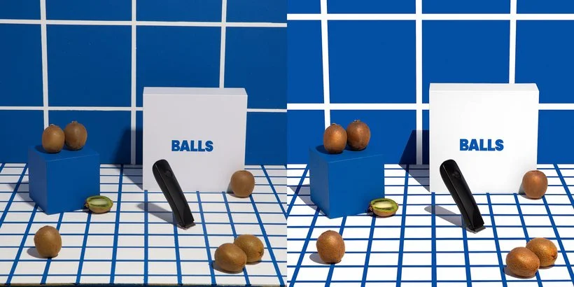
Okay last example because this project was such a hoot... Haha! But notice how in our still for Balls I used the pattern already there and just polished it. Took me a million years but SO worth it. It makes such a difference and really brings the set to life. Not sure if you guys are crazy like me but when I see lines, I just want them to be straight and perfect, haha!
Create A Digital Pattern
One of the others ways that you can truly make your work unique is by adding your own customized pattern. I'm not an Illustrator person whatsoever but Elle is and she was the one to make this really cool pattern for another still (and GIF) of ours for Benefit which you'll see below. Honestly, this doesn't just have to live as a background, you can add a digital pattern to just about anything if done right. Elle was almost going to paint this pattern onto some 2x4 particle boards but I felt that it was likely going to be easier for us to just add it in post. Given that most of the images are a little on the "fantastical" side, it worked out in the end for us to just drop it in. One thing I will say about adding a pattern to anything is just to watch for any shadows. If you want to keep the work semi-realistic, you'll want to take those into account and fake some kind of a shadow or use blend modes to get the pattern to show where it needs to.
Add Subtle (Or Not So Subtle) Surrealism
And lastly, another way that you can add graphical elements to your photography is by simply adding a little surrealism. This one is up to your interpretation but for us it looked like our still below for our client Mella. We wanted to incorporate the nighttime vibes by "reflecting" dusk clouds in the mirrors. Now, you can go crazy if you want. If you want to add clouds or a water graphic/stock image to part of your image and make it the supporting act, be my guest! I don't think there's anything wrong with getting playful and pushing the envelope if the client is into it!
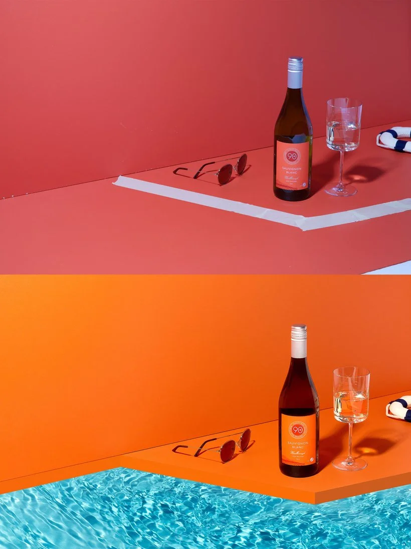
Below you'll see the fun clouds in the mirrors for our Mella still/banner and the example underneath is the time we faked a little "pool" scene for 90+ Cellars by digitizing the pool edge and then adding an image of water. Kind of looks funky but in the end we were digging it and we had fun creating it.

So there you have it folks! I'll be back next month to share part 2. Hopefully you enjoyed all the fun ways we've added graphical elements to our images. I plan to post my video of the month for Saturday and Sunday level members this week and it will go along with this post so you can see the editing in action! :) Anyway, would love to know your thoughts on getting graphical with our imagery. Are you a fan, not a fan? Share with us over on Slack!
Is it the weekend yet?
Arabela