

Adding Graphical Elements to Your Images Part 2

Hey everyone! Long time no talk (or read?)... You know what I mean, haha! I'm actually writing this post in advance because Elle and I are trying to make a conscious effort to batch create all of our content during our two least busiest months which for us tend to be January and July. Anyway, I'm here to continue my series of "Adding Graphical Elements to Your Images." Although you don't really need to read this series in order, we totally welcome you to read part 1 as it is already live on our Patreon.
Like I mentioned previously, adding graphical elements to your imagery is one of best ways to truly make your images unique to your photography brand. If you're familiar with our work, you might have already noticed that we take a lot of visual inspiration from graphic design which is why you'll see a lot of funky graphical elements in our work including fake water or sparkles, turning regular mirrors into a sky portal, digital backdrops that could have only been made in Photoshop, and so forth. So let's continue this series by sharing a few more ways that you can add that special touch to your product photography.
Incorporate a Gradient
Gradients can be so fun and look amazing in product photography images if done right. And by "done right" I don't mean to sound like I know the best way but sometimes adding a weird graphical element where it doesn't work, wasn't intentional, or just doesn't make sense for the product is what I'm referring to. As I was thinking about what images to include for this particular way to add a graphical touch to your images, I totally remembered one of our early photoshoots from way back when for a company called Sunwink where Elle had literally created/painted a "gradient" background. I mean, I was truly impressed and I loved the painterly aspect to it and it honestly turned out amazing. I feel like that was one of those instances where creating a real, natural gradient background by hand worked with the product and their branding at the time. I'll add a couple of images below so you guys can see what I mean.
Definitely a fun type of background but like I mentioned, you can definitely also incorporate/create gradients in post-production and that's what I'll be referring to going forward. When it comes to adding gradients, you can either make them the main background or make it a part of your image somehow. One tip I highly recommend if you're going to be adding a gradient to your photos is always add a tiny bit of grain onto your gradient. Otherwise, you'll likely get some of that weird banding that likes to show up when there's sharp color transitions, especially if the gradient has a lot of colors. The slight grain actually helps smooth everything out and makes it look more seamless, haha! Another tip I can recommend, especially if you're placing a gradient behind an actual person or tricky subjects that have hair or texture, is try doubling (or even tripling) up the gradient layer and you'll notice that the gradient will show up more seamlessly behind your subjects. I may have to show this in an actual video post so that you guys can see what I mean but it makes the biggest difference.
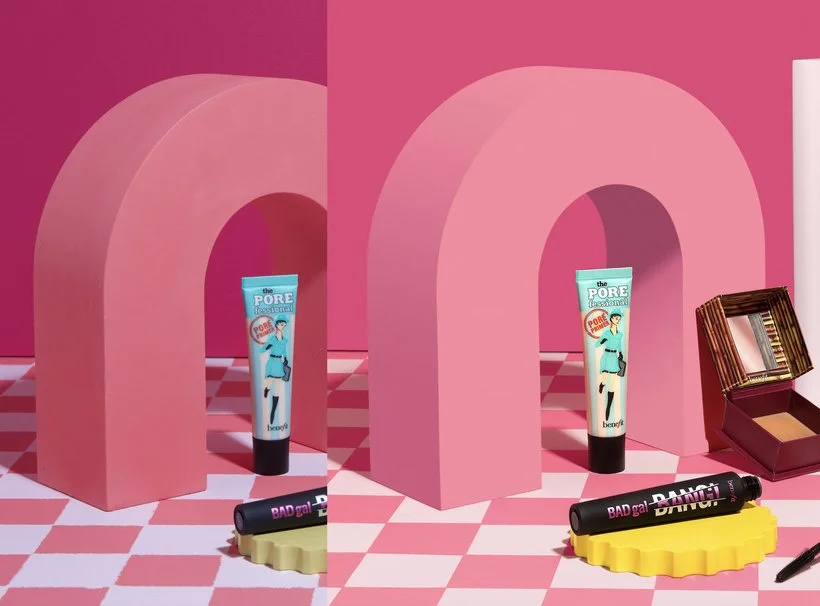
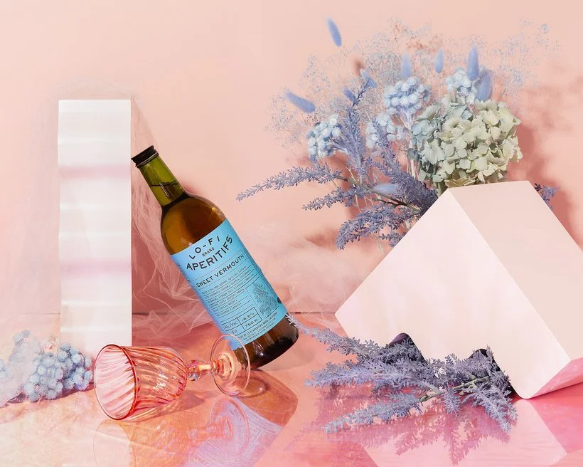
Now there's two main ways that you can incorporate or add gradients: Subtle or DRAMA! By subtle, I'm referring to a gradient where you might go from a "light pink" to a "dark pink" for example. Or you might do something a lot more dramatic where you have quite a few colors as part of the gradient. An example of a subtle gradient would be something like what I did for our Benefit Cosmetics shoot. I actually included the following image in part 1 of this series under "Digitize a Prop or Background" but what I'm trying to point out is that the Moodelier arch prop's side is actually a gradient. In order to digitize the prop while still making it look realistic, I needed to create a gradient that went from that bright pink to a darker shade of pink. One thing I always try to look out for if I'm making subtle gradients is just paying attention to how the light falls on the area. In this case, it's obvious that the side of the arch gets darker as you go down. So yeah, there you have it, a subtle gradient!
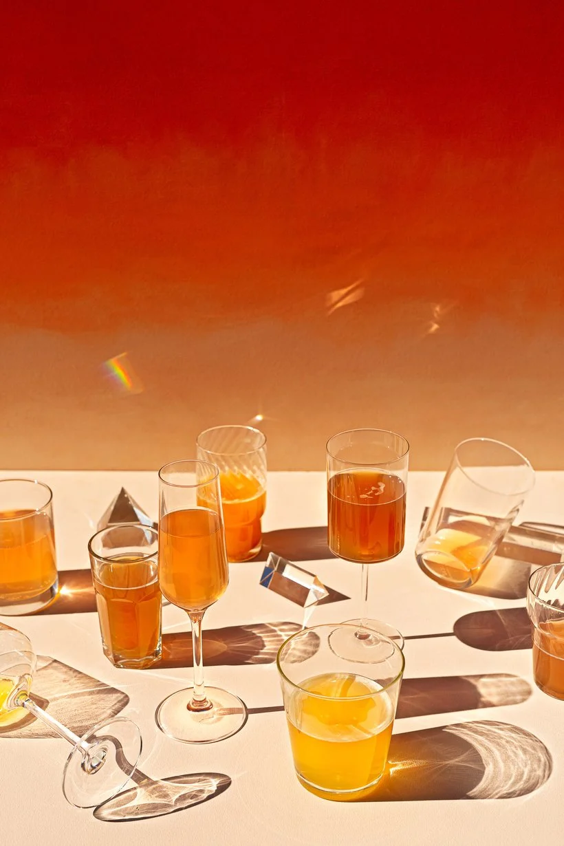
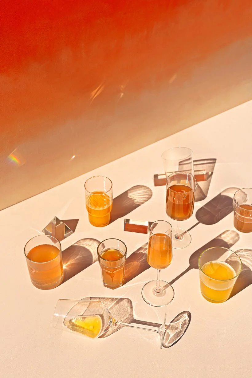
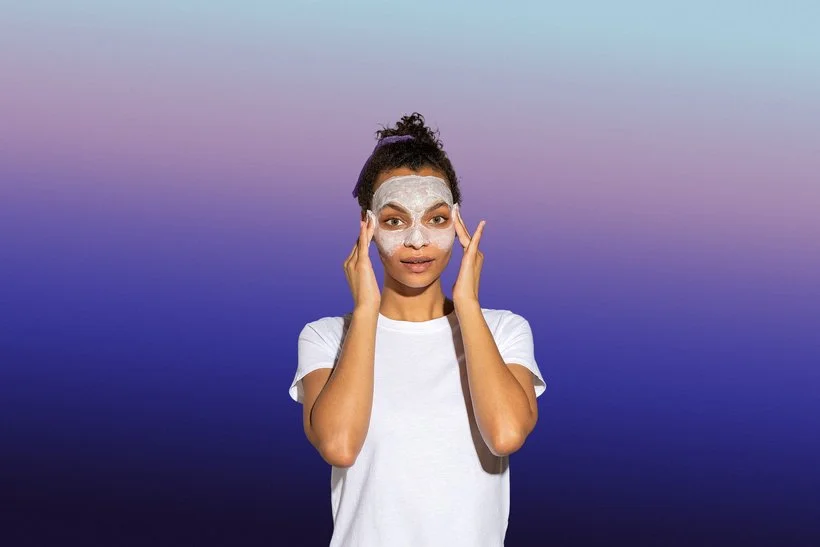
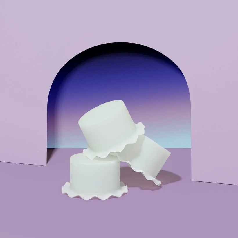
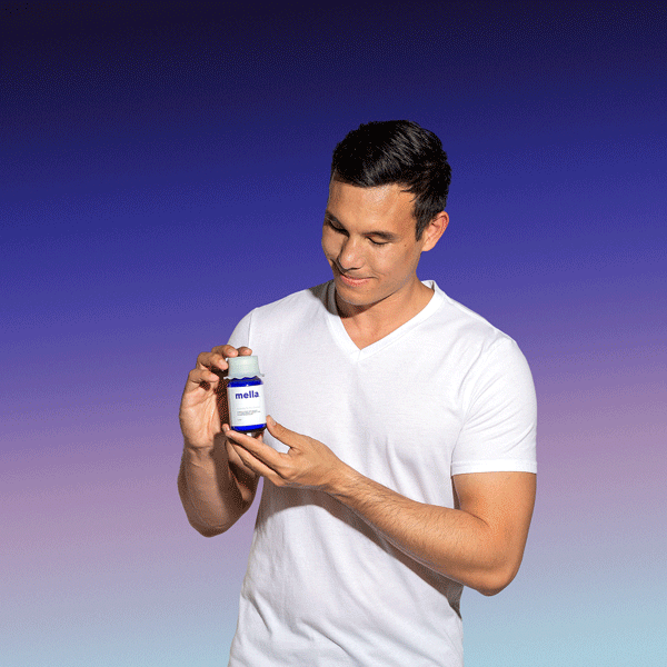
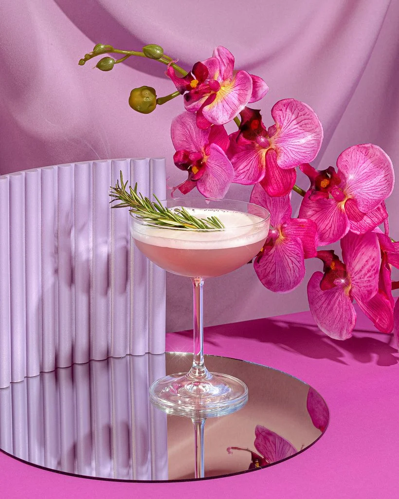
Now for some DRAMA, we actually had a lot of fun gradients in our photoshoot with Mella. You may have seen some of the work in previous posts but it was the skincare company that has melatonin as an ingredient so they were all about that nighttime, dusk and dreamy vibes. Therefore, it was a no brainer to actually get to play around with some slight surreal vibes. Mella had actually created a very specific gradient that was a part of their branding so I was able to use that gradient file and import it into Photoshop. We actually incorporated the Mella gradient in quite a few of the images including these product shots as well as the stop motions where the models shows how to apply some of the products. This was definitely one of those instances where I had to double, even triple, the gradient layers to make everything look seamless. We also played around with the angle of the gradients for the various images and stop motions for a little more variety. Check out the finals below! Oh and one thing to note, when you are exporting GIFs for web, you're bound to get some slight banding even after adding a bit of grain so don't feel like that's not normal, it's definitely normal. Especially with gradients that have multiple colors like the ones below. :)
Add Sparkles to Highlights
I'm 10000% that all of you know about this next technique! Sparkles are one of the best ways to add that little graphical touch to any image. Although there are multiple ways to actually get sparkles or shine in an image during your shoot via a specific lens, some kind of material, or by simply photographing shiny objects, you can actually easily add sparkles in post-production and there's so many ways to do so. You can definitely find a plethora of free sparkle photoshop brushes, stock, or vectors online that you can download and literally import to Photoshop and start using straight away (this youtube tutorial has a sparkle brush download included). Or if you're into creating something yourself, you can also make the sparkle from scratch. This youtube tutorial shows you how you can create your own. We love it! This is definitely one of those things where you can also go subtle or literally bring the DRAMA! One quick tip which I'm sure you already know of is adding the sparkles specifically to any parts of your images that have "hot spots" or highlights. Those are definitely the best places to add that extra glimmer in my opinion! Below are a few examples where we've added some subtle sparkles to our work.
Create Digital Shapes to Frame an Image
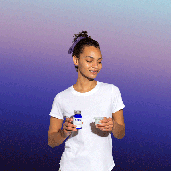
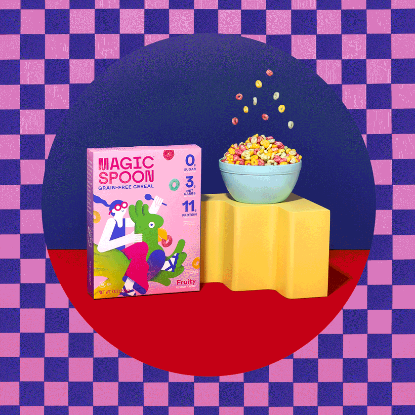
Now this next technique (and last for part 2) is such a fun one and probably one of the more easier ways to add that graphical element to your images. It can make such an impact and just look super cool. So let's talk about creating digital shapes to frame your images. This could literally be anything and it makes for such a unique photo especially because you can take a certain color or a shape that's already a part of the image and just use that as a guide or inspiration for the digital shape. A great example of someone who does this often to their images would be our friend Diane Villadsen. She loves to do this to both her creative portraiture and product photography and I'm sure you can find examples of it on her Instagram. We've definitely done this to some of our work in the past including some of the images for Mella and our personal project featuring Magic Spoon. Check them out below and you'll see exactly what I mean.
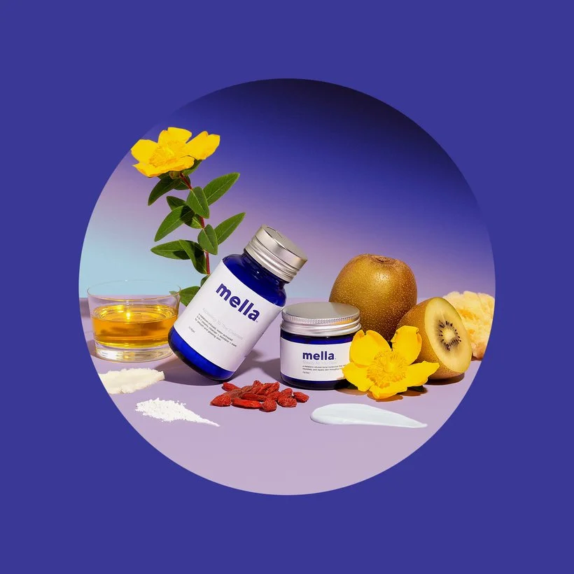
For the Mella image above, we wanted to create this sort of "portal" into this little Mella world and so we took one of their main branding colors and used that to encompass the whole image and it turned out to be really cool and striking! Like I mentioned, you can really take whatever shape (or even another image) and frame your images this way. Below you'll see another one of the ways that we added a "round portal." Although this is such a fun technique, I don't know that we would create digital shapes for just anyone. It has to make sense with the brand, their vibe, and what they're going for. To us, it only made sense to add these graphical elements due to the nature of the actual products. Mella has the dreamy like branding that works to add that surreal touch and Magic Spoon, well, it has magic in their brand name so I think that speaks for itself, haha!
So there you have it folks! Part 2 down and only one more to go to finish this series out. Be sure to stick around and definitely let us know in the comments or over on Slack whether you've used any of these methods to add graphical elements to your images. It can be such a creative way to spice up your images for sure!
Is it the weekend yet?
Arabela