
Before & After: Mella
Happy Tuesday ya'll! We've got another before and after post for you and this time we're featuring our shoot with Mella. This was definitely one of my personal favorite projects that we got to work on in 2021 and I'm stoked because we're finally able to share most, if not all, of the final work. I absolutely loved the entire color scheme (which actually was a gradient) and it really pushed me to learn some new editing techniques in order to execute our ideas. This shoot also served as a great reminder that not all sets will work out as seamlessly as you think. Sometimes you might want to "cut corners" in order to keep the project moving but what ends up happening is you might spend more time editing than you had planned and/or you have to reshoot certain images again. This happened to us during this project and while it wasn't our favorite moment, it definitely was a good learning lesson for us and I'll get into what I mean in a second. One thing I will say is that this client was an absolute ANGEL. Regardless of the issues we had and having to go back and forth to refine the editing and reshoot some of the main stills, they were so grateful and appreciative the entire time which honestly made it all worth it. BEING NICE GOES A LONG WAY. Am I right or am I right?
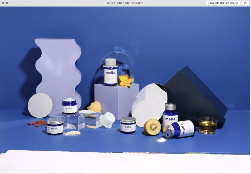
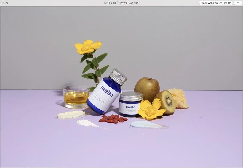
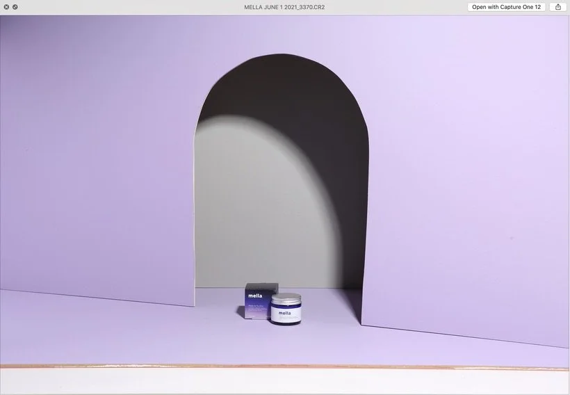
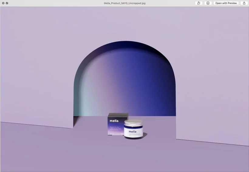
If you want to learn a little bit more about what this shoot entailed, be sure to check out the BTS post for Mella that we posted back in July of 2021. There you'll find out more about the kinds of images they asked us to create as well as what the brand is all about. So let's get into a couple of the issues we had for this project. The first issue being that we had planned for all of Mella's primary product images (the individual product images for their website) to contain our amazing "arch" cutout backdrop that we've used in the past (for Anecdote Candles). Because Mella's products were so small compared to the actual arch, we went into the shoot knowing that I would be doing some post-production magic to bring down the arch and essentially just make it smaller. However, even as I brought down the arch, our client still wanted us to crop in even further to make the text readable since their website was going to use a hover zoom feature. As I cropped further in and sent in our revisions, both our client and us noticed we were losing quite a bit of quality and this was because of how far away we had photographed our set to fit in the arch. It was pretty frustrating and we knew that we had to reshoot the products at a much closer range and eventually composited them in. Another issue (which wasn't really our fault at all) was that our client chose a really light color for their text which naturally makes it more difficult to see when it's against white so that was something we let them know about and hopefully they make some changes to that in the future. I'll go ahead and post some examples of this first issue below and hopefully you guys can see what I mean.
The OG:
After Editing:
I think you can see in the edited version how small the products still were even after I brought down the arch and even after sending this edited version, our client wanted the product to be WAY bigger than this.
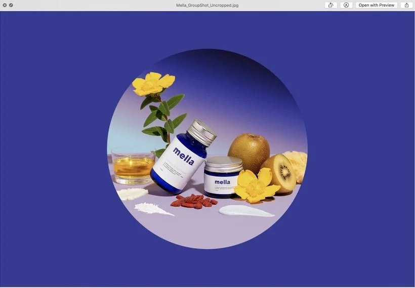
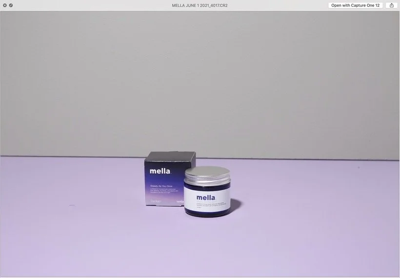
Our Reshoot (of just the products captured much closer in order to still retain detail):
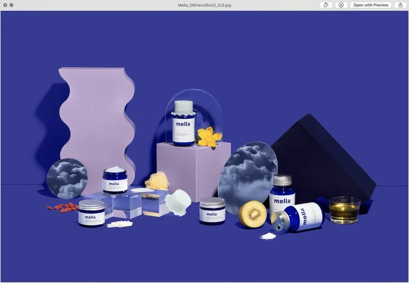
The Final Edit (phew!):
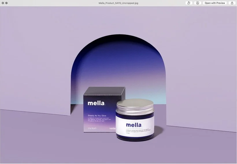
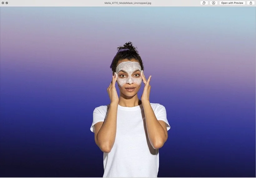
As you can see, the gradient also changed in the final edited image and that's because our client really wanted the direction of the gradient to go from top to bottom or vice versa instead of from left to right. So that was a whole situation of having to re-edit EVERY SINGLE ASSET that had a gradient in it which honestly was 80% of the GIFs and about 60% of the stills. It was a PROCESS, ya'll. Phew.
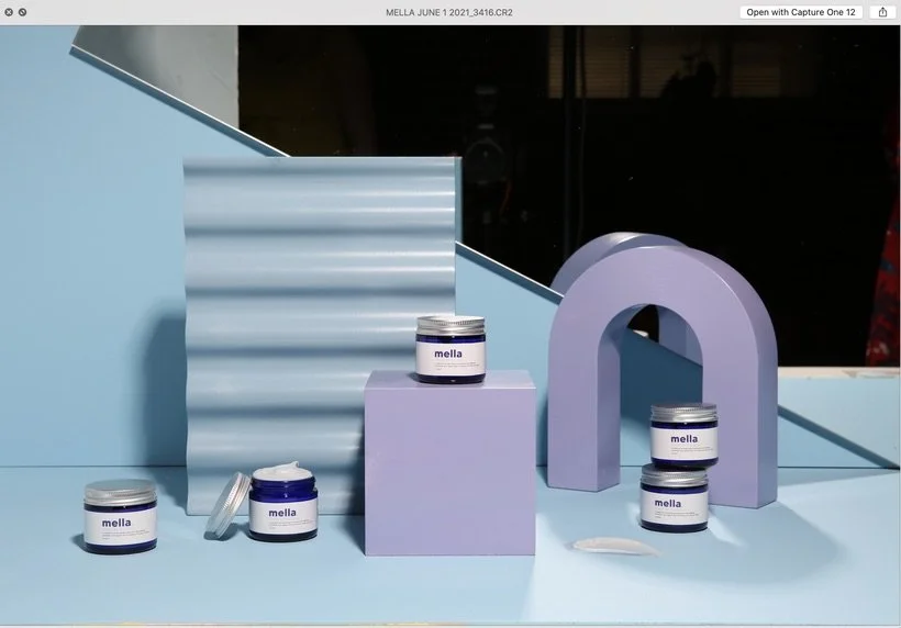
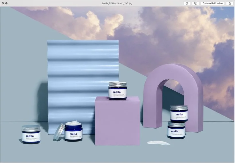
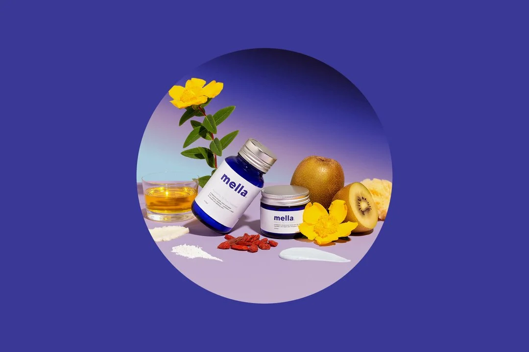
Another thing that was tricky was selecting the right colors for the backdrop. You could probably tell that the lavender in the RAW was significantly lighter than the colors we ended up editing into the image so that's just something to keep in mind when you're buying paints at the store. Certain colors will naturally look lighter if you're using strobes or powerful lighting.
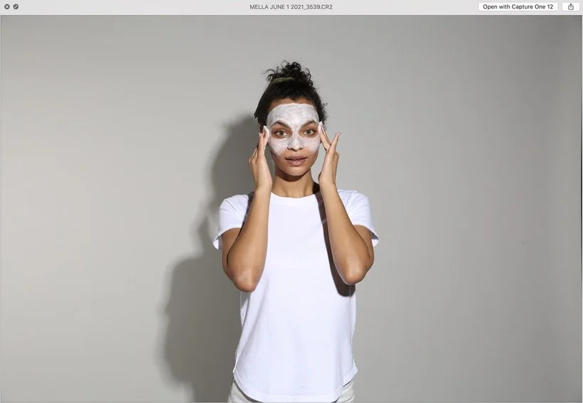
One of the reasons we chose the gray as the backdrop for the primary product images and the model shots/GIFs were because we planned on compositing the Mella gradient in post. It needed to be something neutral so that it would be easy to drop in the gradient and not have any weird color cast on the models.
For some of the other header/banner images, we knew that we were going to composite some sky backdrops into some of the mirrors and now that I look back, I think we definitely didn't need to use that large mirror in the header shot. We could have still composited that sky and it probably would have looked the same. You live and you learn!
I hope you guys enjoyed today's post and let me know what you think. Below you'll find more fun before & afters of some of our work for Mella. Don't forget to join Slack you guys! The party is way more fun if we're all in it haha.
Is it the weekend yet?
Arabela