
Blending Modes: Color
Hi everyone!
Hope you're having a CORNtastic Wednesday... And if you have no idea what I'm referring to. Please watch the interview with Tariq on Recess Therapy and bless yourself on this fine LUMP, *cough* I mean hump, day. Ok! Ok! I'm done. Anyway, that's not what we're here to talk about even though corn is pretty great. Haha! In this post, we're talking all about Blending Modes in Photoshop, specifically "Color," because even though they're more common in other types of creative art, they are still super useful in product photography retouching for a few different reasons and I definitely wanted to share that with you all. You may already know some of the ways in which we use blending modes in our everyday retouching workflow but if you're just getting started, then I hope that this rundown is useful for you guys! Let's dive in.
Ok but that entire bit on The Office was hilarious. Alright moving on... To quickly define it, blending modes are "modes" that you can apply to a layer in Photoshop. They sort of dictate how a layer interacts with the layers below it. These blending modes are a perfect way to nondestructively edit and still get a different visual output depending on which one you use and how. I don't know about you guys but when I was first messing around with Photoshop (I think I was like 11 or 12?), blending modes were always so fun to experiment with because of their unpredictability. Back when ~sepia~ was in, I loved adding a yellow/orange color to an entire portrait and then changing the blending mode to "multiply" to get that faded and warm vintage tone. Now I can sit here and tell you about all the different blending modes there are but that would be boring and besides it's already been done, haha! If you wanted to dive into the specifics of each blending mode, I'd recommend checking out this post. However, for this post in particular, I'm going to be focusing on the blend mode "color."
So, why this specific blending mode? Well, it's pretty simple. This is my go-to blending mode anytime I'm adjusting colors. Sometimes it's not as simple as adding a hue/saturation layer and moving over the sliders. There are times when I'm working with a very specific color (and/or strict brand guide) and it's not always possible to get that exact spray paint color. I'm a die hard fan of the phrase "FIX IT IN PRE!" and most of the time, it's possible but other times, it's just not. And that's where selecting, applying a color fill layer, and changing the blending mode to "color" in Photoshop can be a game changer.
Below is an example of how I used this blending mode to change the color of all the Moodelier props. As you can see there's a pretty big difference and in this case, it was important that the colors were almost exact. You can definitely play around with the opacity or the fill if you need to pull the color back slightly. We don't usually want our images to look super frankenstein-y.
Before:
After:
While "color" typically yields the results I need, there are times when it doesn't look quite right. For this reason, I tend to venture off into some of the other blend modes such as "Darken" or "Multiply". If you're changing a color pretty dramatically, it's important to consider the shadows (or lighter parts) and whether the color you are applying looks "realistic". Unless of course, you're going for a funky out-of-this-world vibe, sometimes one blending mode may not work and that's why I like to experiment between Darken, Multiply, Hue and Color to get to the result I want.
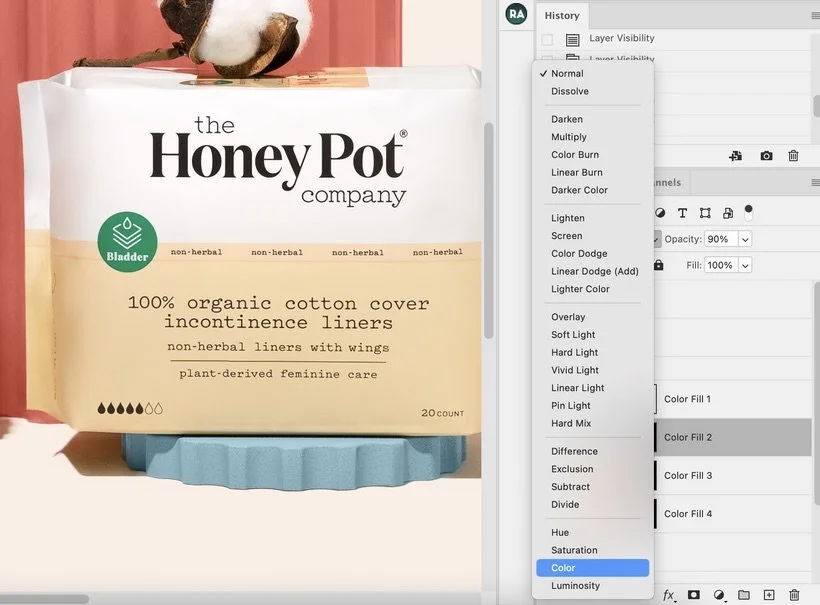
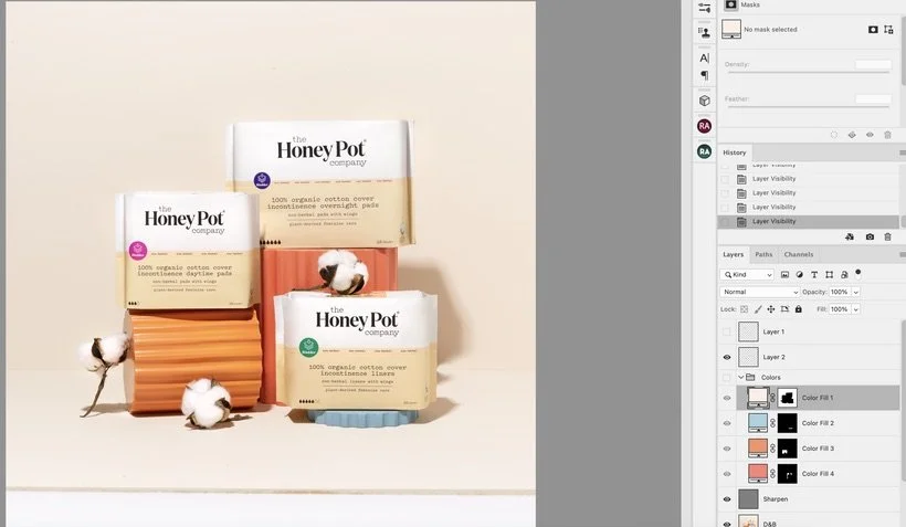
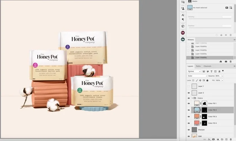
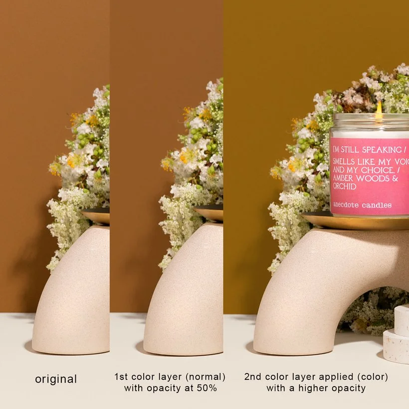
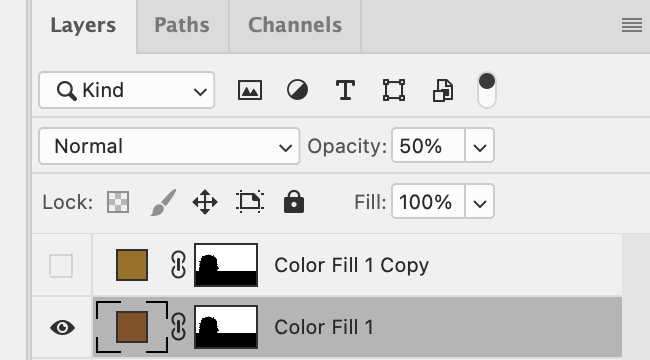
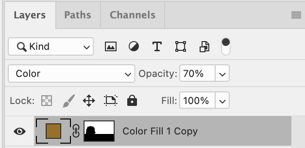
One of the other ways that I like to use this blend mode is for adjusting/adding color to the backdrop. In the example above with the Honey Pot Co products, you can tell that I didn't need to add a blending mode to the color because I wanted it to be smooth and filled with that exact color (leaving the blend mode at normal.) However, there are times when I do want to retain the texture of the backdrop and adjust the color as well. So what I'll typically do is select the background (excluding the shadows), add a color fill layer with a mask, sample the main color, leave the blending mode at normal and reduce the opacity to about 50% so that the texture still remains through. I like doing this because it sorts of evens out the tone of the color and makes it "semi-smooth" without completely losing the detail/texture of the backdrop. From there, I'll create a second fill layer, sample the color I actually want it changed to, set the blending mode to color and either keep the opacity at 100 or lower it to my liking. See below for an example!
Blending modes are pretty cool and I'm definitely a fan! In the next post, I'll be diving into how we like to use Soft Light and Linear Light and some other ways that you can use these blending modes in your workflow. Until then, let's chat in Slack! :)
Is it the weekend yet?
Arabela