

Principles of Design in Photography #4: Repetition
Hello Weekend Club Members!
Today I'm continuing the series I started about applying the principles of design in photography! As a recap, I studied graphic design in college at San Jose State. While I am not technically a graphic designer now, I am grateful for that background because it comes in handy in what I do now, not only for designing our website and downloads but also in the way that I think about photography. I didn't realize this until people started telling us that our work had a very graphic quality to it. Subconsciously I've always applied the things that were hammered into my brain during my design education and I think that it's made our work stand out.
There are seven principles of design: emphasis, balance and alignment, contrast, repetition, proportion, movement, and white space. I include color as well. While you probably won't use every single element in every single image, thinking through these principles and how they can be applied is so helpful in planning and styling your images. The more that you think about them, the more second nature they become. In this series, I'll be walking you through each principle and sharing examples of how it can be applied in your own work.
You can read the first post on emphasis here, balance and alignment here, contrast here, and then let's get into repetition!
Repetition is pretty self-explanatory, it simply means to repeat elements in a design or in this case, photo. Designers use repetition in design as a way of bringing a sense of cohesiveness to a design. This creates unity, emphasizes important points, creates a style, and helps to create hierarchy in your work. You could repeat colors, textures, props, products etc but you could also repeat themes or placements (ie same setup but completely different props in each photo) which are a little more subtle.
This technique can be used in one single image or it could also be used in a series of images to tie them all together. This is something that we recommend you think about with client work but even if you're just working on a personal project. If the images will live together on a website, social media channel, etc it's important that they work together and belong. Repetition is an easy way achieve that connection.
When I'm working on a series of images I try to think about what I can use to achieve cohesiveness - the simplest way is usually through color but often I will repeat props or themes as well. I have a whole blog post on this which you can read here but for now let's dive into some examples of repetition in our work.
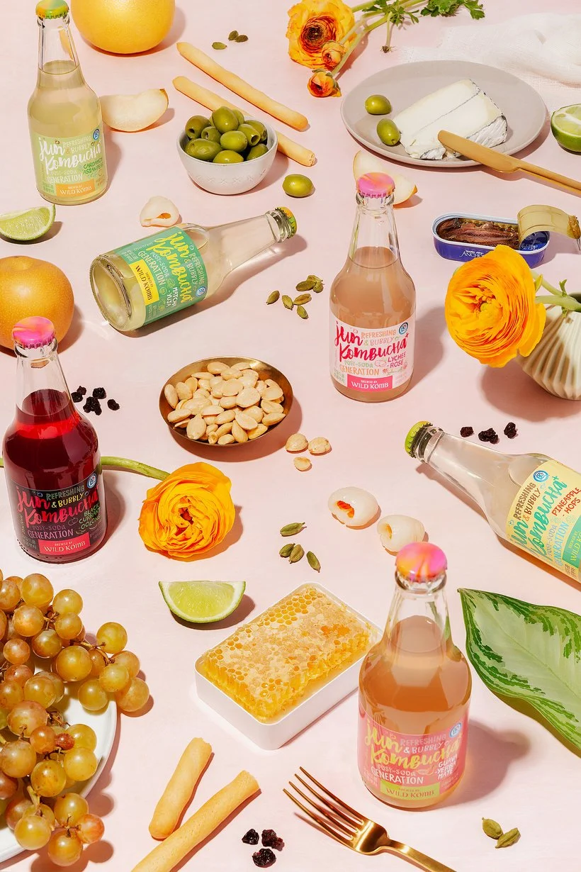
In this image we repeated products, colors, and props. There is a lot of pink but the repetition of green in the scene draws the eye through the image and also calls the focus to the natural/healthy ingredients in the drinks. There is also repetition of ingredients throughout the scene which unifies the photo.
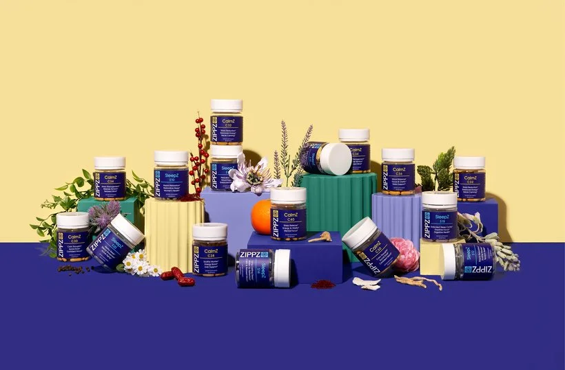
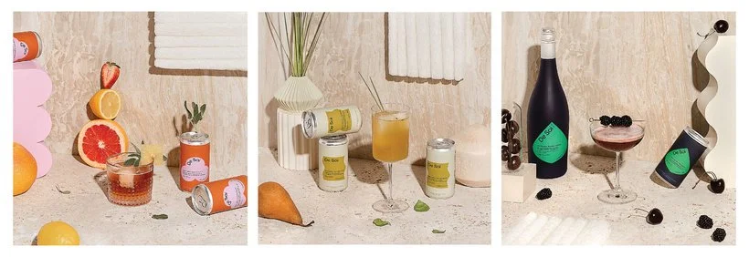
This is another example of repeating colors, props, and products. None of the ingredients are repeated and part of the challenge for this shoot was that the products have a ton of ingredients and they wanted to show as many as possible in each image so we had to figure out a way to do that and also use their bright colors without making the images overwhelming. We did that through keeping the sets simple and repeating the props and colors while letting the ingredients shine.
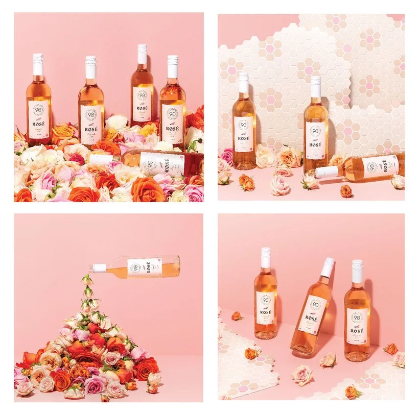
Here's an example of how repetition can create a unified set of images. Pink and roses as well as bottles are present in every photo, but tile is only in 2. Because of the strong repetition these images can still live and work well together even though the tile is pretty different than the simpler backgrounds of the other 2 images.
In this series of images, we repeated the background as well as the bumpy piece of foam in each shot. We also repeated the placement of the glass and repeated using ingredients in each shot.
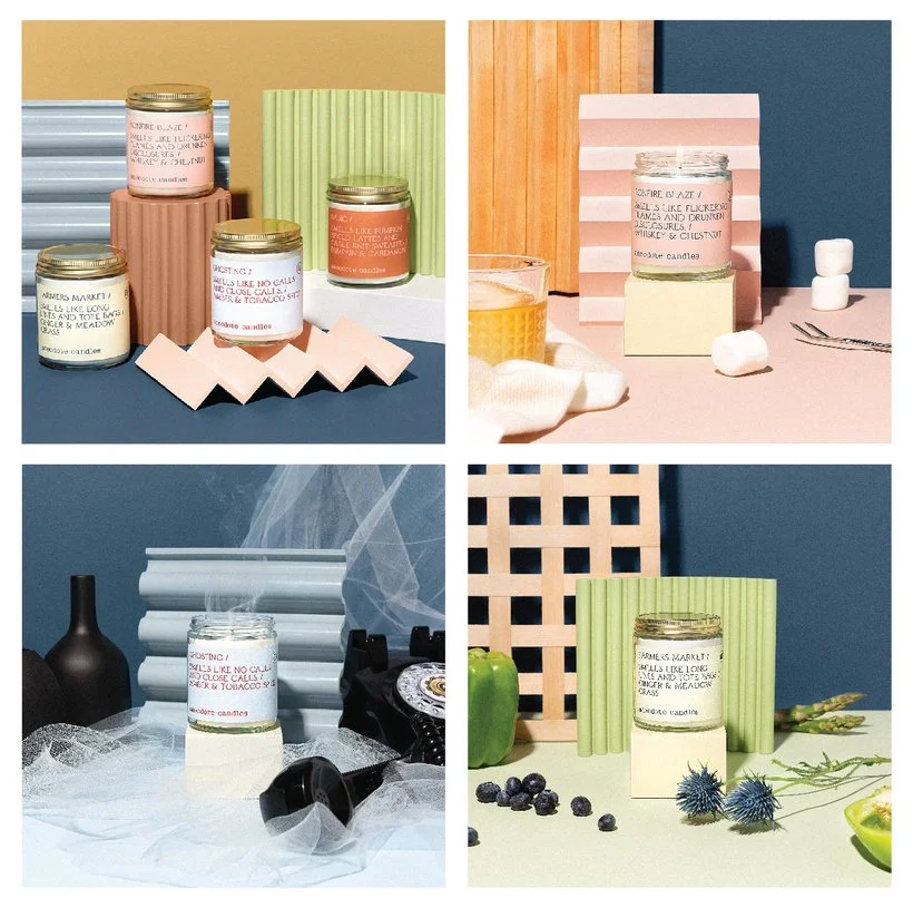
Here's an example where it could have been really easy for these images to be too different from each other to work well. This was for the fall release of these candles and the client wanted a group shot and then individual shots that reflected each different scent in a story-telling manner. I decided to use one color in all shots (the navy) and then to use one prop from the group shot in each photo. That way no matter which individual shot was paired with the group shot it could belong.
We then also placed the candle in the same spot in each individual spot as well as the prop from the group shot. The repetition is simple and subtle and a lot of people might not notice right away but it really helps to emphasize the product and story as well as connect the images.
I hope that you're enjoying this series! It's ben fun for me to go through our images and look for examples of these things. I love getting into the nitty gritty of images like this and I would love to see any examples of repetition in your own work so feel free to share below!
Is it the weekend yet?
Elle