

Gray Cards & Color Correction
Hi all! Happy Monday (or Tuesday at this point?) I hope that this week is a productive one for you all. I'm saying it now because I also want to manifest it for myself because let's be honest... With so much travel happening these past few months, both Elle and I have been feeling super disorganized. Here's to hoping that this week goes smoothly and we get to cross off a lot of things on our to-do list!
I wanted to talk a little bit about one of our most helpful tools when it comes to color correction. I honestly don't know how we ever worked without a gray card before but there was an obvious difference once we started using it. I look back at some of our early shoots and oh man, not only do I cringe but I also see how the color temperature changes slightly from image to image. So, if you're just getting started in product photography, don't be like us and let the camera (or your editing programs) do all the guessing. Get yourself a gray card ASAP as possible and keep reading below to find out why it makes our lives easier and what to do if you're in a pinch and don't have one.
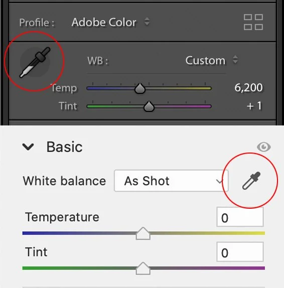
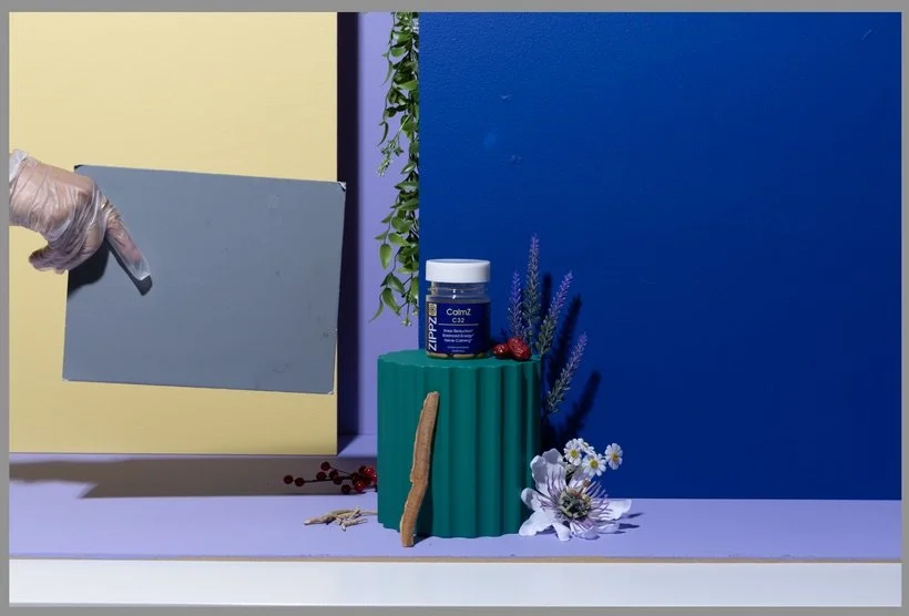
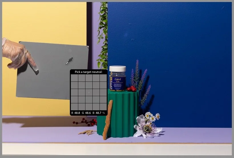
Well it's no surprise that color correcting your images is essential to great product photography. Not just because you want to show the accurate colors of the products but it's likely that you've chosen your set and backdrops based on a brand's colors. Most of the time, there's a chance that you'll have to tweak your set slightly. For example, it's not always possible for Elle to get the EXACT color paint for our particle boards and so I often have to go in and correct those colors but in order to do that, our entire image needs to be the right color temperature to begin with. That's where our trusty gray card comes in to save the day. It's truly as simple as taking one gray card shot for every set/backdrop change. Even if the shot doesn't actually "color correct" itself with the gray card in your scene, you'll notice the biggest difference once you're in the post-production phase. When you're ready to edit, all you have to do is take that little eye dropper tool (see below) in the White Balance section in Lightroom or Adobe Camera Raw and click on the gray card to fix your colors. See below to see a quick before and after. Notice how cool the original shot is and how much the colors change in the after shot.
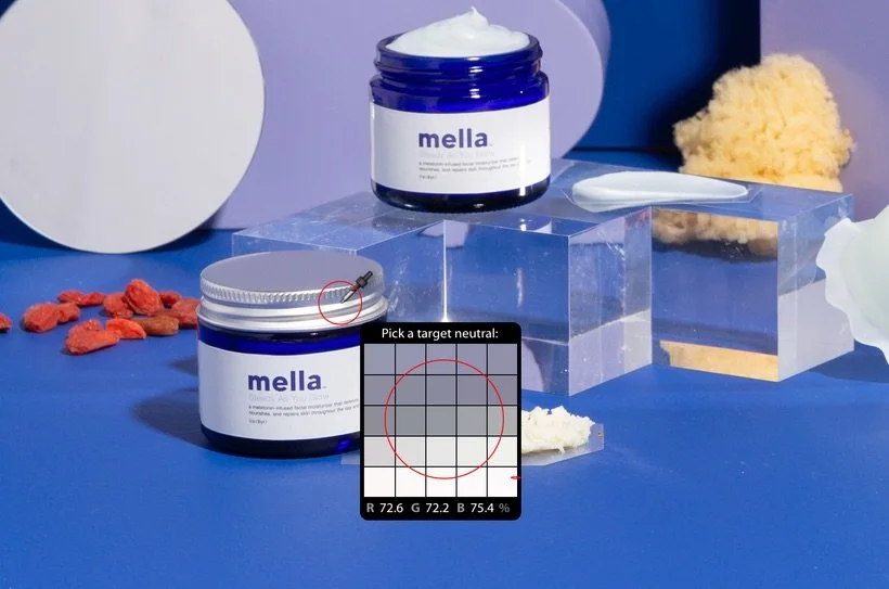
Let's say you're in a bit of a pinch and completely forgot to bring or use your gray card in your photoshoot. Don't worry! We've all been there, including myself. I always revert to these three methods to see which gives me the most accurate white balance. The first method being that if you know you have a "neutral" gray somewhere in your scene, you can take that same eyedropper tool and click on that part of your image. This method is essentially eyeballing and recognizing what might be neutral gray in your image. See below for an example where I recognized that the lid on my product likely had a gray and so I started clicking in that general area until I settled on a white balance that I felt was pretty close.
The second method that I like to test out when I don't have a gray card (or don't have any neutral gray in my image) is simply using one of the dropdown options in Lightroom or Adobe Camera Raw. For example, since we always shoot with our strobes, it's pretty likely that the "flash" option in the menu will work well. It may not always be accurate but it will get you pretty close and you can always tweak it further if necessary.
The last method that's a little more old school but still worth mentioning is the curves method in Adobe Photoshop. Essentially, you'll want to make a new curves adjustment layer, select each color channel (Red, Green, and Blue) and drag the sliders to the end points of each histogram. It's a bit hard to explain so here's a video of our friend Jesus Ramirez from the Photoshop Training Channel showing you exactly how it's done: Easy ONE-CLICK Color Correction in Photoshop | Quickest Way To White Balance a Photo.
Well, I hope I've convinced you to get yourself a nice little gray card because it truly does make things a lot easier when editing. While there are many out there in the market, all you really need is the simple 8x10 18% Gray Card. If you want to get fancy with it, you could always pick up the more expensive X-Rite ColorChecker Classic Card which offers a lot more colors and different "gray" options. Whichever you choose to go with, you won't regret it! If you have another way of color correcting your images, feel free to let us know in the comments or on Slack!
Is it the weekend yet?
Arabela