
The Principles of Design in Photography #2 - Balance
Hello Weekend Club Members!
Today I'm continuing the series I started about applying the principles of design in photography! As a recap, I studied graphic design in college at San Jose State. While I am not technically a graphic designer now, I am grateful for that background because it comes in handy in what I do now, not only for designing our website and downloads but also in the way that I think about photography. I didn't realize this until people started telling us that our work had a very graphic quality to it. Subconsciously I've always applied the things that were hammered into my brain during my design education and I think that it's made our work stand out.
There are seven principles of design: emphasis, balance and alignment, contrast, repetition, proportion, movement, and white space. I include color as well. While you probably won't use every single element in every single image, thinking through these principles and how they can be applied is so helpful in planning and styling your images. The more that you think about them, the more second nature they become. In this series, I'll be walking you through each principle and sharing examples of how it can be applied in your own work.
You can read the first post on emphasis here and then let's take a look at balance and alignment.
When we think about balance, we need to think about how every item in an image has a visual "weight." Balance refers to the distribution of items in an image. In order to create an image that feels balanced, we need to appropriately distribute the props and items that we use.
Typically larger, denser items will fill heavier while smaller props feel lighter. The color and texture of the props can also contribute to the visual weight, for example darker items tend to feel heavier. If an image is unbalanced, it can feel like the viewer's eyes are kind of sliding to the edge of the photo. It's the same as when you decorate a room, you don't put all of your furniture into one spot because that would feel unbalanced (and also not be functional).
Now, you can balance your image symmetrically which means that items are completely equally weighted on each side of the center line or asymmetrically which means that items may not be equal but there is still a sense of balance, for example one large item on one side and several smaller items on the other to still create an equal "weight." When I'm placing props into a scene, especially a scene that is heavily styled, I'm always thinking about what will make the image feel balanced, sometimes adding or removing props in order to achieve this.
Let's go through some examples of this to give you a visual idea of what I'm talking about.
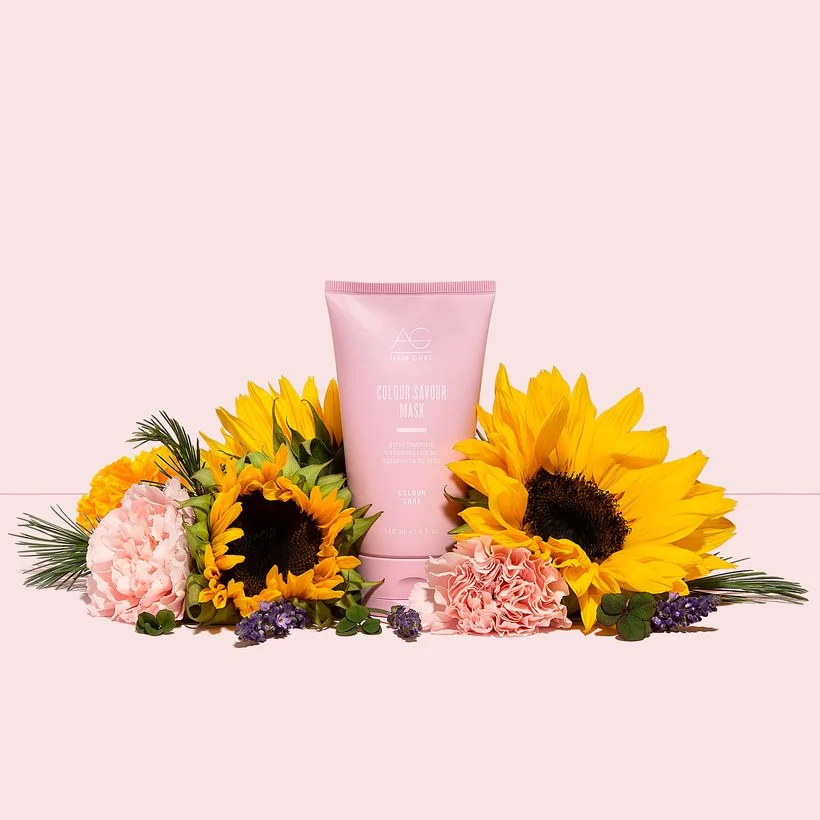
This is an example of asymmetrical balance, the flower on the right is much larger than the others so we added more flowers on the left to balance it out.
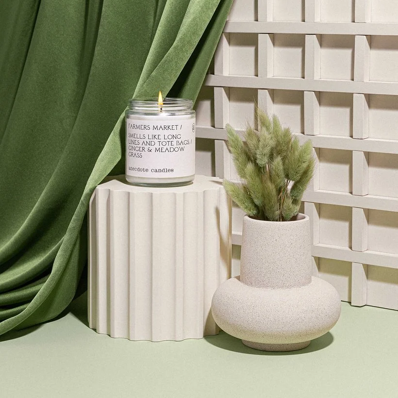
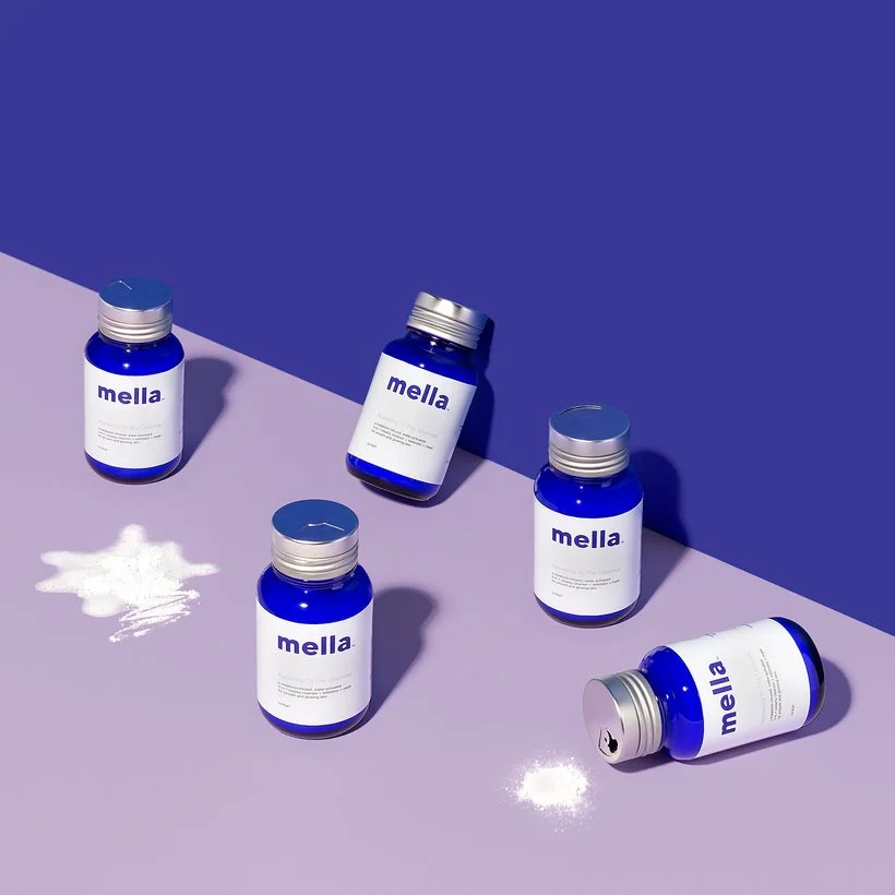
Another example of asymmetrical balance. The green fabric is much heavier than the rest of the items in the image because of the darker color and the texture. Because of this, we added some darker green to the right side by putting the green bunny tails in the vase. This is an example of how the weight of an item can change depending on the image. In some images, the green fabric might not seem as heavy if it is surrounded by darker props or a darker setting.
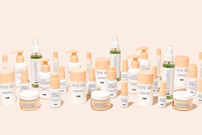
Here is an example of more symmetrical balance, if you cut the image in half the distribution would be pretty even (more so if the middle green bottle were actually in the middle).
In this image, the six bottles are spread out pretty evenly with the two leaning bottles separated. The product spills are also separated to create more balance.
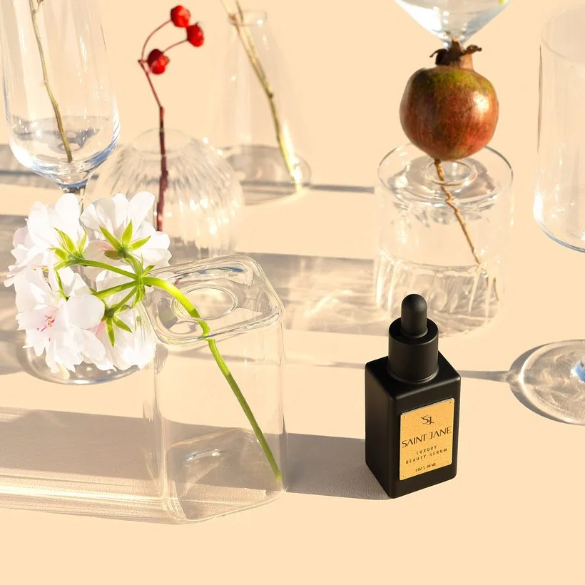
In this image, the black bottle is super heavy so we balanced it with the pink flower and the pop of red on the left. That pink flower definitely could have a lighter weight in some images since it's such a light color and texture but because it's larger than the bottle and has the green stem it looks more visually heavy. The red on the left adds even more weight and helps to balance the red on the right.
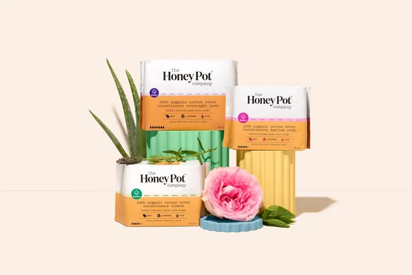
The aloe and the rose in this image are each more heavily weighted so we separated them to ensure a balanced image.
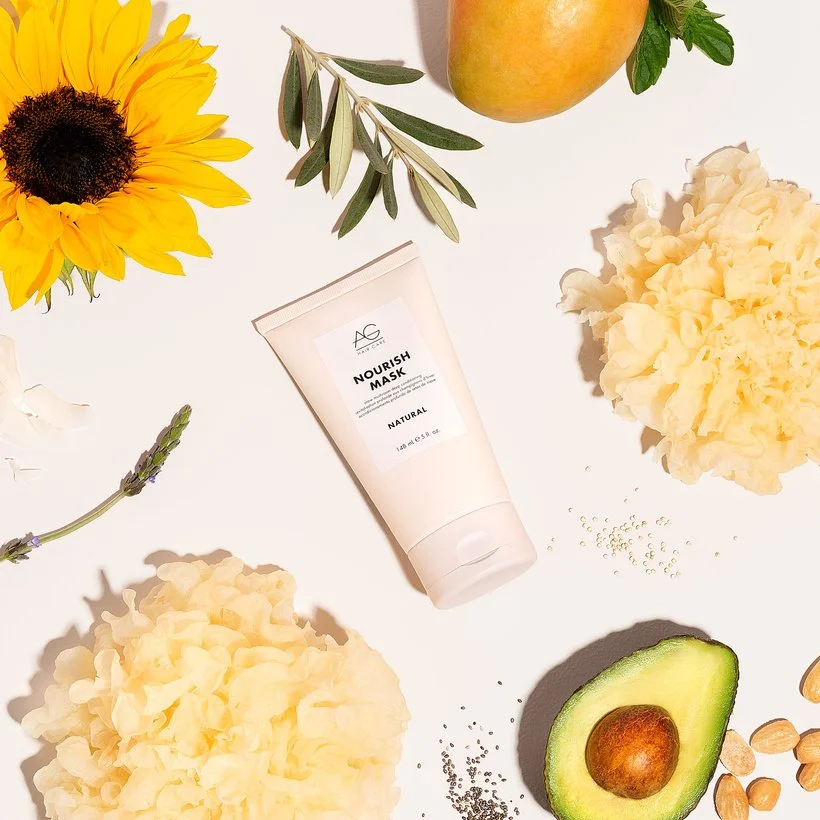
In this image, we placed items on opposite sides, almost but not quite directly to make it feel evenly weighted. For example, the two snow mushrooms and the avocado and sunflower. We added in the larger items almost across from each other first and then filled it in with the smaller props.
I hope this was helpful for you! Feel free to ask questions below and share any examples of emphasis in your work over on Slack in the portfolio review section.
Is it the weekend yet?
Elle