
The Principles of Design in Photography #3
Hello Weekend Club Members!
Today I'm continuing the series I started about applying the principles of design in photography! As a recap, I studied graphic design in college at San Jose State. While I am not technically a graphic designer now, I am grateful for that background because it comes in handy in what I do now, not only for designing our website and downloads but also in the way that I think about photography. I didn't realize this until people started telling us that our work had a very graphic quality to it. Subconsciously I've always applied the things that were hammered into my brain during my design education and I think that it's made our work stand out.
There are seven principles of design: emphasis, balance and alignment, contrast, repetition, proportion, movement, and white space. I include color as well. While you probably won't use every single element in every single image, thinking through these principles and how they can be applied is so helpful in planning and styling your images. The more that you think about them, the more second nature they become. In this series, I'll be walking you through each principle and sharing examples of how it can be applied in your own work.
You can read the first post on emphasis here and balance and alignment here and then we can dive into contrast!
Contrast is essentially how different the attributes or objects are from one another in an image. Contrast could be created through colors, this is what people usually think of first, but it could also be created through different textures, sizes, alignment, etc. Often times contrast is used to draw the eye to the point of emphasis, for example a bright pop of color in the middle of dull colors.
Contrast adds visual interest and it attracts the eye. The greater the difference between two or more elements, the more something stands out and the greater the contrast. There are definitely times where it makes sense to have a low contrast image, for example in a monochrome shot but even when the contrast overall is low, you want to be intentional about this so that the image is not flat. Even in a monochrome image you could create contrast through size and texture.
Here are some examples of contrast in our own work:
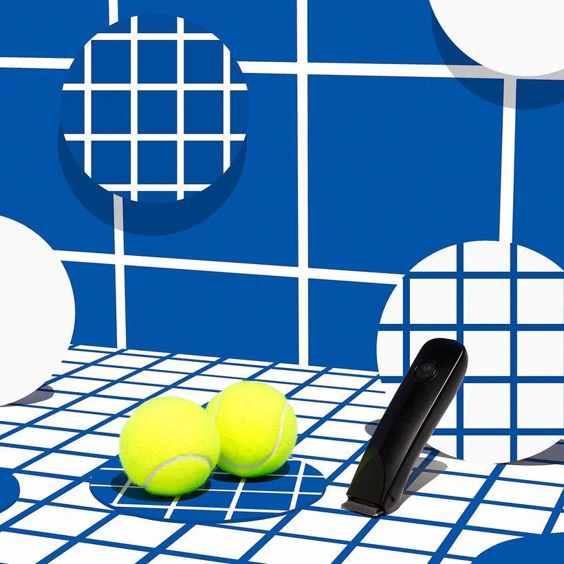
In this image there is contrast in the patterns and shapes but the largest contrast is in the color, the pop of neon against the blue and white. This draws your eye right to the focal point of the image which is the balls that represent the male anatomy that this product is used on. Even though the image is somewhat busy with the different shapes and patterns, the emphasis is still clear because there is so much contrast.
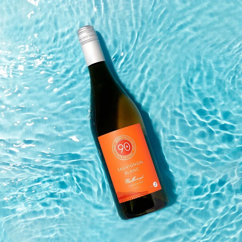
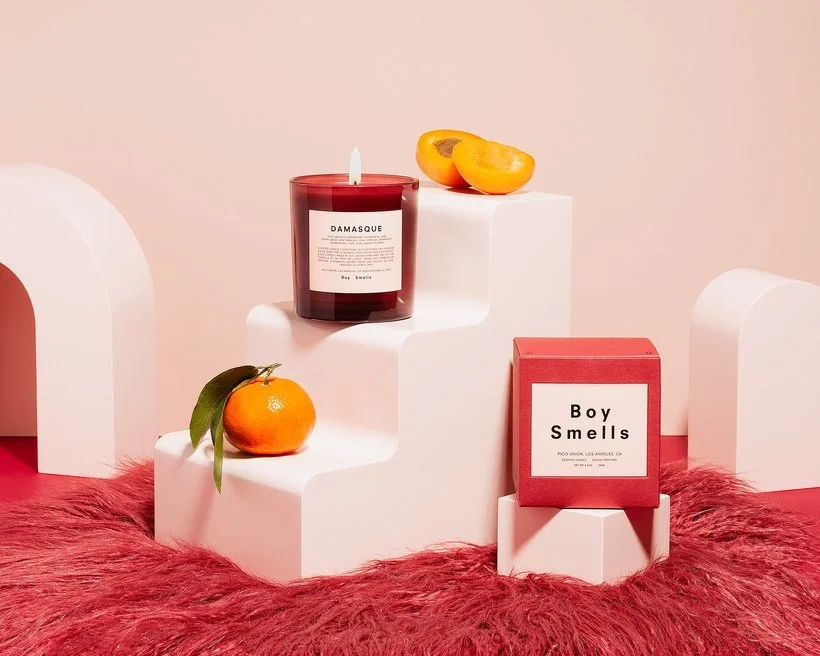
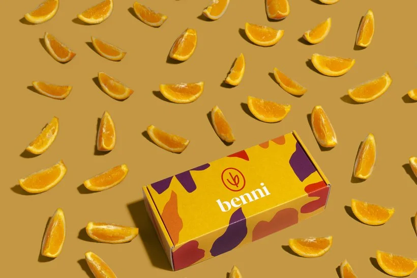
This is another example of using color to create contrast. It's also an example of how color theory can help to create contrast - the further apart that colors are on the color wheel the more contrast they have. Orange and blue are directly across from each other so using those two images together will create a high-contrast image.
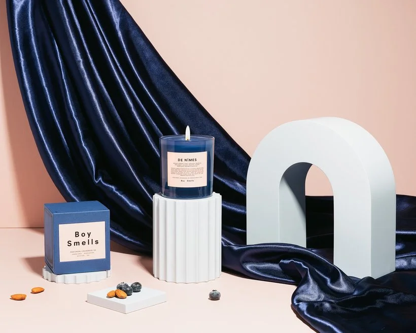
These two images are an example of using texture to create contrast. The top image has the furry fabric on the bottom and the second image has the silky fabric flowing throughout the image. These textures are contrasting with the smooth and matte texture of the props and product.
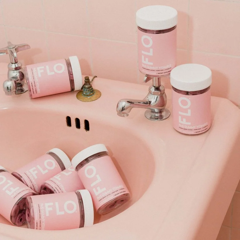
Here is an example of a very low-contrast image. Almost everything is the same color and even the logo is pretty subtle. The main contrast here is in the alignment (some bottles placed away from the others) and the size and amount of product in comparison to the set.
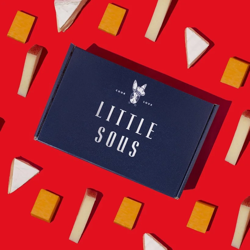
These two images have some contrast in color (mainly the top one which has a lot of color contrast) but the main contrast is in size. The props are small and plentiful but the product which is the focus is larger and singular. Even though the bottom image has lower contrast in color, the contrast in size and amount help the product to still stand out. The top image has the potential for confusion as well even though the colors are contrasting because both the product and props contrast from the background so the size and amount help in this case too.
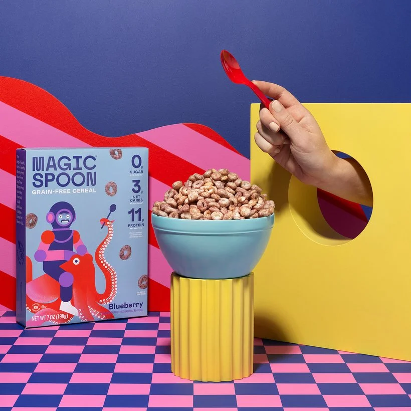
This image has a lot of contrast, high contrast colors and a few patterns which can be difficult to balance. It's easy for the point to be lost when you have too many contrasting elements so this is something you want to think through. We made the cereal the focus by making sure nothing else had that brown color and using the pop of red in the spoon to draw the eye.
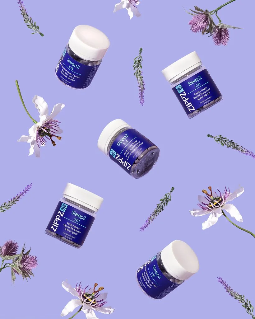
Here is another image that has fairly low contrast, there is slight color contrast with the dark blue label against the lilac background but in this image the ingredients were just as important as the product to the client so it's ok that there is less contrast.
I think one of the main points of this series besides helping you think about how to apply these elements into photography is to also help you to think critically about the choice you make when planning and styling. I don't think there is really a right and wrong in photography (for the most part) and most things that make an image strong or weak come down to the thought process behind it. An image that has low contrast can be very strong if the thought process is there and comes through in the final shot.
Anyway, I'd love to hear your thoughts on contrast below! Also feel free to link any of your favorite examples of using contrast in your own work!
Is it the weekend yet? Elle