

The Principles of Design in Photography: Emphasis
Hello Weekend Club Members!
I'm starting a fun new series talking about one of my favorite things - applying the principles of design in photography! You might not know this, but I actually studied graphic design in college at San Jose State. I had a long college journey which started with elementary education, eventually transitioning into wedding planning which led to deciding to switch to a graphic design degree so that I could go into wedding design. My first real photoshoot that I directed was actually a wedding styled shoot in collaboration with a wedding photographer - you can see it here if you're interested.
While I am not technically a graphic designer now, I am grateful for that background because it comes in handy in what I do now, not only for designing our website and downloads but also in the way that I think about photography. I didn't realize this until people started telling us that our work had a very graphic quality to it. Subconsciously I've always applied the things that were hammered into my brain during my design education and I think that it's made our work stand out.
There are seven principles of design: emphasis, balance and alignment, contrast, repetition, proportion, movement, and white space. I include color as well. While you probably won't use every single element in every single image, thinking through these principles and how they can be applied is so helpful in planning and styling your images. The more that you think about them, the more second nature they become. In this series, I'll be walking you through each principle and sharing examples of how it can be applied in your own work.
Let's get started!
Emphasis is the main focal point of your image. It is the point that your eye goes to first. Most of the time, if you're shooting products, you want the product to be the star of the image and the focus of the image. A good question to ask yourself when you're planning out images and then again when you're styling is, "what is the point of this image? What am I trying to communicate?" The answer to that question should be the emphasis of your photo.
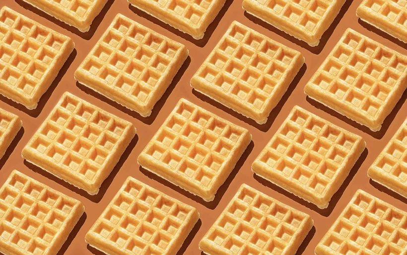
Sometimes there is a primary emphasis and secondary emphasis (or emphasises - is that a word? LOL). For example, you may have the product as the emphasis but the ingredients as the secondary focus. Sometimes you don't have the product in the image at all, and instead there is a story that you are telling. Sometimes you don't have an emphasis at all, for example when you have a pattern that is the same all throughout the image.
The place that the viewer's eye goes to first is the point of emphasis so make sure that this point is what you want it to be and not something else that is competing with your main focus. You can create this point by putting whatever you want to be the focus in the center of the image, elevating it, using color to draw attention, etc. Here are a few examples of this in our work:

This image uses color to draw the eye right to the cup. It's centered and all the surrounding colors are neutral so that blue really pops and attracts the eye.
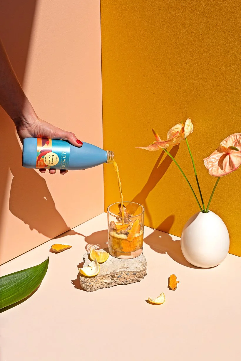
This image also uses color - the blue bottle stands out as the only pop of blue and the stream from the blue bottle leads the eye to the secondary emphasis which is the glass of turmeric. The other items in the photo such as the leaf, flowers, and ingredients point towards the emphasis.
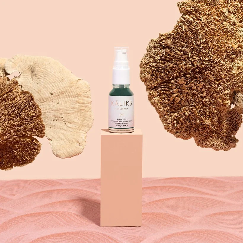
In this image, the product is on a stand in the center which makes it the clear focus. It's also the only item that is a teal color and the other props point towards it, reinforcing the emphasis.
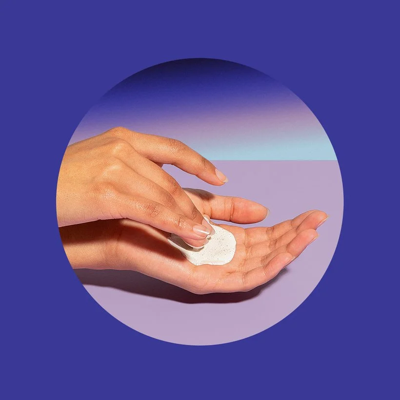
In this image, we used a circle shape around the hands to draw attention to the texture of the product which is the focus.
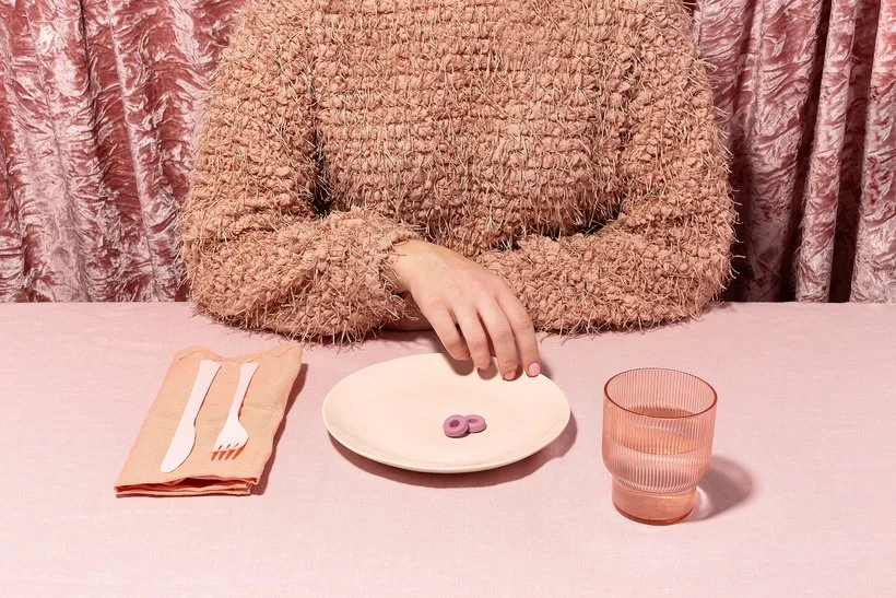
The focus of this image is the vitamins on the plate - they are small and the scene is monochrome so we created emphasis by putting them towards the center of the image and using the hand to draw attention to them. One thing to note - as humans we like to look at human elements, especially eyes.
If you have a face in your image, know that the eyes will probably automatically become the emphasis because anyone who looks at the image will first look at the eyes. If whatever you want to be the focus is not placed near the eyes or hands make sure to use something else very compelling to draw attention to it.
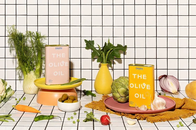
Both of these olive oil containers are of equal importance in this image. The yellow one automatically draws more attention, so we put the pink one onto a stand to give it a little boost and make it more equal. We also added some yellow to that stand to help balance out the focus.
Here's an example of an image without any focus.
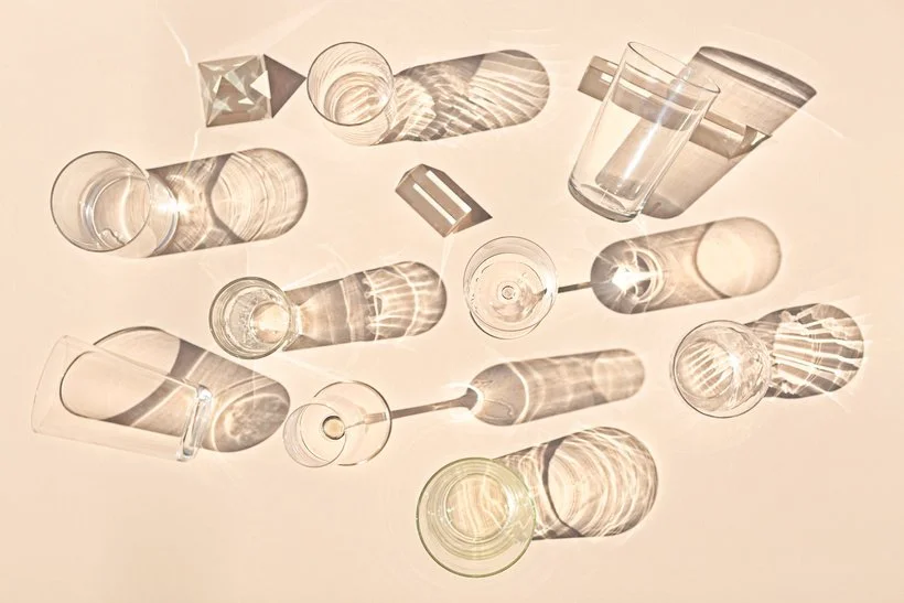
Another example of when you may not have a focus in your image.
I hope this was helpful for you and that you're excited for this series! Feel free to ask questions below and share any examples of emphasis in your work over on Slack in the portfolio review section.
Is it the weekend yet?
Elle